I was in charge of the paint treatments for a production of Dracula at a local community college a few years ago. There were painted castle blocks EVERYWHERE on this set, so the technique used needed to be fast, easy for new student volunteers to learn and effective. Here’s how we did it.
Step 1: Base Coat
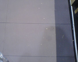
The designer wasn’t particularly fussy about the predominant shade of gray to be used as long as it looked like a pretty neutral gray. We mixed our initial base coat gray out of slop paint leftover from extra shows. In the end we needed to add about half a gallon of black to darken it a bit, but the designer was then happy with this very affordable base coat. The first step was to base every surface that was to be castle blocks.
Step 2: Permanent Marker Lines
Our second step was to lay out all of the blocks with black permanent marker (i.e. Sharpie ) lines. We cut some strips of luaun to the height of the blocks and some to the width and then used these strips to trace where the lines would be. Remember to stagger the lines for the widths of the blocks. If at all possible it is best to pick block sizes so that the seams of luaun fall on seams between blocks. Luaun seams are MUCH less noticeable there, and even help you out a little.
Step 3: Textured Roller
The designer (Michael Diederich) had picked out what colors he wanted to use in texture over the gray. We took those colors and poured them into roller pans and using a Sea Sponge Roller that we occasionally dipped in a roller pan of water, we rolled random patterns all over the gray with marker lines. The water helps the texture vary in intensity, and learning how much to keep in your roller is a trick that just takes some practice, so we started with the walls that would be least visible and farthest upstage to get everyone’s confidence up.
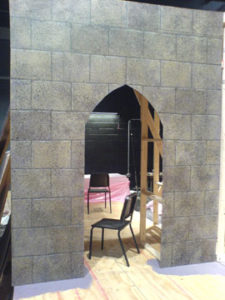
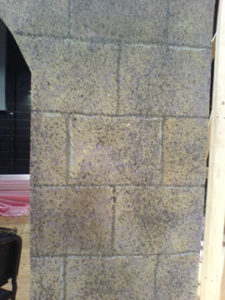
Step 4: Black lining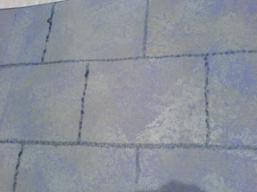
When the roller textured paint dries, the marker is actually very visible, because permanent markers have a waxy kind of thing going on that bleeds through paint. The marker lines are too narrow to read well from the audience though, and are too straight to read as actual cut rock. Our next step was to take a small lining brush and tape it to a favorite bamboo pole or broom handle. We also watered down some black paint to lining consistency. Variation in how bumpy the line is and how dark it gets in some places and that kind of thing makes the stone look more realistic. Even skipping little bits of line can help the realism. As long as the lining stays relatively on the marker and your marker lines were straight, it will look quite straight from the audience. SO, we dipped our lining brushes and traced those marker lines as fast as we could. Working quickly will help you be sloppy enough to look real. If you’re too straight the blocks will look more like concrete than stone. While variation in width is good, generally a line averaging about 3/4″ wide is a good choice.
Step 4: Shading Some Rocks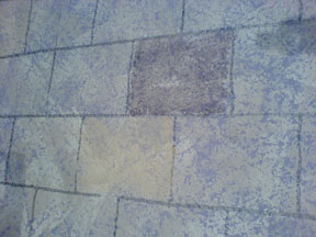
Looking at a brick or stone wall in real life, it’s easy to notice that some of the blocks are significantly darker or lighter than others. To imitate this, we mixed a three different watered down shades for toning individual blocks. Using a sea sponge or rag, we picked out random, individual blocks to tone. Make sure the toning imitates the kind of texture used elsewhere. Sometimes, perhaps only shade part of a block. Experiment and have fun. This step is one that can go on forever if you let it, so watch the time. Remember the toning will dry much lighter than when you apply it, so mix it so it looks a little more intense than you think it should be. Test it in a not-so obvious place and let the test area dry.
Step 5: Highlights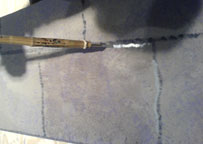
Pick a direction that most light will be coming from. In this case it was top and center. On the sides of the blocks facing the light source, (for us the sides facing toward center and the top edges) apply a watery highlight (probably off-white or light gray) using a small lining brush. The highlights want to be very broken and uneven, unless concrete is the goal. They also want to be narrower than the black shadow lines. Perhaps ¼” or 3/8” is right around where it should be.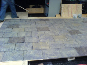
Step 6: Spatter
To help the highlights, shadows and shading feel more cohesive and also add a bit more texture, our final step was to spatter the walls with 3 different colors. We used a very watery black, a slightly thicker chocolate brown and a yellowish color that was a shade between two of our original roller colors.
In this version of painting castle blocks, the painting is now complete.
If you have lots of people and lots of space, some of these steps can happen at the same time. For example, toning specific blocks and black lining and highlighting can all easily overlap, as long as caution and common sense are used. (In other words, don’t highlight a recently toned block, and don’t tone over a highlight.)