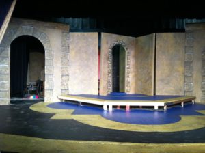
All theaters work under constraints, so it’s good to know some ways to get the “effect” you want with less investment from time to time. In this case, the budget and time frame were both short and so I needed to make it feel like a castle interior quickly without spending much.
This show, The Lion in Winter, was a particularly small budget with a tighter than usual time frame too. I was just writing my article about a small turntable on a small budget and found this series of pictures and thought they were a fun example of how to downsize a castle blocks project. The part of blocks that takes the longest is the layout and lining of ALL THOSE LINES, so if we can minimize lining, then the painting process takes less time. Here’s what we did.
Step 1- Basecoat
In this case we base coated using a Sea Sponge Roller scumble. (Someday there will be a section on exactly that technique, but for now, we’ll just say you use two colors and a sea sponge textured roller to make a big, random, wet blended mess.) In this case the two colors I used were a sandy color and a grey. I’m pretty sure some of my color choice for this step was based on what we had in stock… or what I found for sale in the Oops Paint.
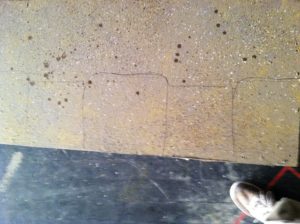
Basecoat, Spatter and Blocks Drawn
Step 2- Spatter
There is already some texture from the base coating process, but I wanted the texture to have depth, so we spattered like crazy, in a few different colors. There was at least grey, white, brown, yellow and a muddy green, but knowing me there was probably another color or two in there. I didn’t work too wet with the spatter and let the different layers dry a bit between colors. (Don’t know what spatter is? Check out my Spatter article!)
Step 3- Draw block details
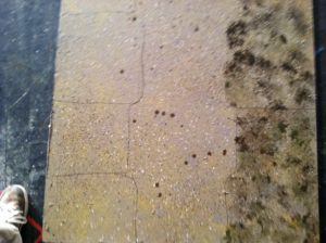
Blocks Drawn on the left and Drawn and Sponged on the right.
I kept the blocks that needed to be lined and detailed the places that made the most visual impact. In this case I chose doors and a few edges. We drew out the alternating sized blocks in a pencil. Sometimes I’d use sharpie for this step, this time I didn’t and I don’t remember why. I might have been out of sharpies.
Step 4- Sponge contrast texture on blocks
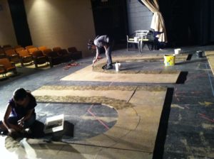
The student in the foreground is sponging texture. The student in the background is lining shadows.
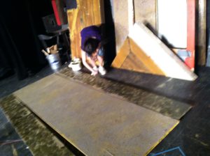
In this case we sponged with a dark brown and a dark muddy green using a sea sponge . I had a student work with a try to sponge alternating with both colors and water. I had her put a little puddle of both colors in the pan, away from each other. She kept the sponge wet using a side bucket of water and would first dip in water and then in one color and pat in in an open spot in the tray until it was the right consistantcy for what we wanted and they she sponged over the area in the lines with that color for a while, then she’d repeat with the other color, working so they two colors would undulate amongst themselves a bit. She was careful to not get too thick, so the background texture would show through a little, but the new wet colors covered enough to make the overall color and texture different.
Step 5- Lining shadows
To paint shadows we used a lining brush (scenic fitch) and black paint watered down to lining consistency, so it’s translucent when it dries and flows smoothly off the brush. (Article on lining technique coming soon). If you don’t have a lining brush, a long bristled narrow brush, or even a thin chip brush will do ok.
A row of blocks with shadow lines, but not highlights. “Down” is to the right.
As the sponged texture dried, we started the process of adding the shadow lines. I decided the “light source” would be from the top of the center of the stage. Deciding on a direction for your light source is important because if you have any question where to paint shadows, you just need to think about where the “thick” parts would cast shadows from a light source in that direction. I wanted the wider blocks to also look thicker than the narrower blocks, so the shadows on are on both the top and bottom of the narrow blocks… but the thicker shadow appears on the “top” of the narrow block because that is where the thicker block would cast more shadow. We also added shadows to the offstage side parts of the blocks and we followed the line that we thought the shape would cast a shadow in.
The straighter your shadow lines, the smoother your rock will look. The rougher the shadow lines, the rougher your rock will look. (That’s true with highlights too.)
Step 6- Lining Highlights
Some of these blocks have highlight and some still need highlight. See what you’re aiming for?
For this step the sponge texture needs to be completely dry, but the shadow lining can still be wet as long as you are careful to not let the two wets touch. Water down white (or slightly off white or tan depending on your end goal) to lining consistency and use a lining brush.
A student about to add a highlight.
Deciding exactly where to put highlights and how much and how thick is a tricky business. White paints are much whiter when they are wet than when they dry, so it’s easy to go too light. The highlight looks pasty going on but as long as it’s not too thick it’s good. If it is too thick, then it dries looking WAY too pasty and getting it to look like it’s part of the rest can get annoying. Do some testing to find the right balance. When it dries, it wants to look like color it is, but be translucent enough to show all the textures behind and hint at their colors. In this case, we chose to highlight mostly on the tops and sides of the thicker blocks, and a little on the bottoms of the big blocks and a little on just the sides of the little blocks. This line, for a rough rock, wants to be rough. I took some liberties and added some squiggly highlights in the middle of blocks some places too.
Step 7- More spatter
We spattered over the whole thing again to sink those highlight and shadow lines in. I used at least a light and a dark spatter, but probably at least three. You can do this layer of spatter while the highlight and shadow are still damp, just not sopping wet.
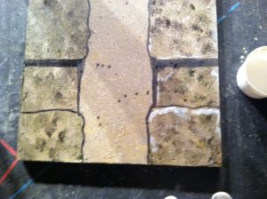
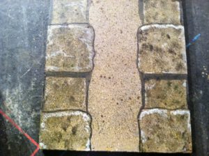
(Mostly) Finished Product
Other thoughts
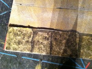
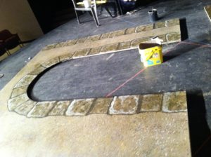
I had some walls that were 6′ wide and got this treatment on both edges. I had some standard sized flats in stock, but rather than using a 4′ and 2′ together I used a 4′ with a 1′ flat on each side, so I could use this painted detail to hide the seams. I made sure that the seam fell into shadow.
The seems are on the shadow lines. This one is just sponged so far.